Adjusting design style can profoundly affect how people perceive your brand. It’s like changing your tone of voice during a conversation; even subtle shifts can completely transform the message.
One font choice can make your brand feel modern and innovative. Choose another, and it feels more traditional and established. Similarly, altering the color scheme can shift the response from warmth and comfort to energy and excitement. These changes not only refresh the look but also tell your brand’s story, subtly shaping audience perceptions and connections.
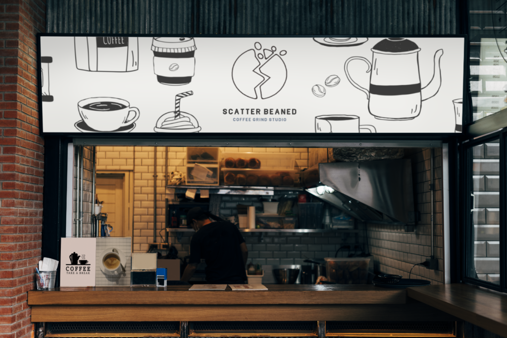
Now, let’s walkthrough a design exercise. Imagine I’m designing for a company named Scatter Beaned. They aim to redefine the coffee experience through their coffee grind studios. They want the design of the logo concepts to reflect how the brand would feel as a local business in various major US cities.
Each city offers a unique flavor, and my goal is to capture that essence, blending it with Scatter Beaned’s identity. By incorporating the city’s character into the visuals—from the colors and fonts in the logos to the imagery in marketing materials—I tailor different ambiance options to fit one business concept.
Company Profile
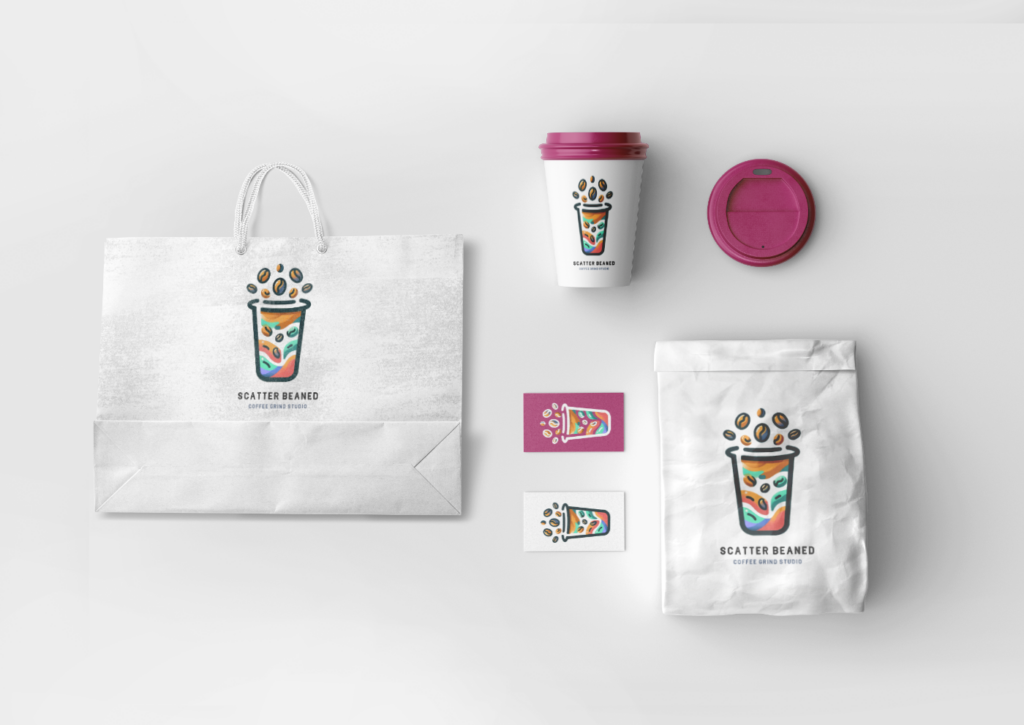
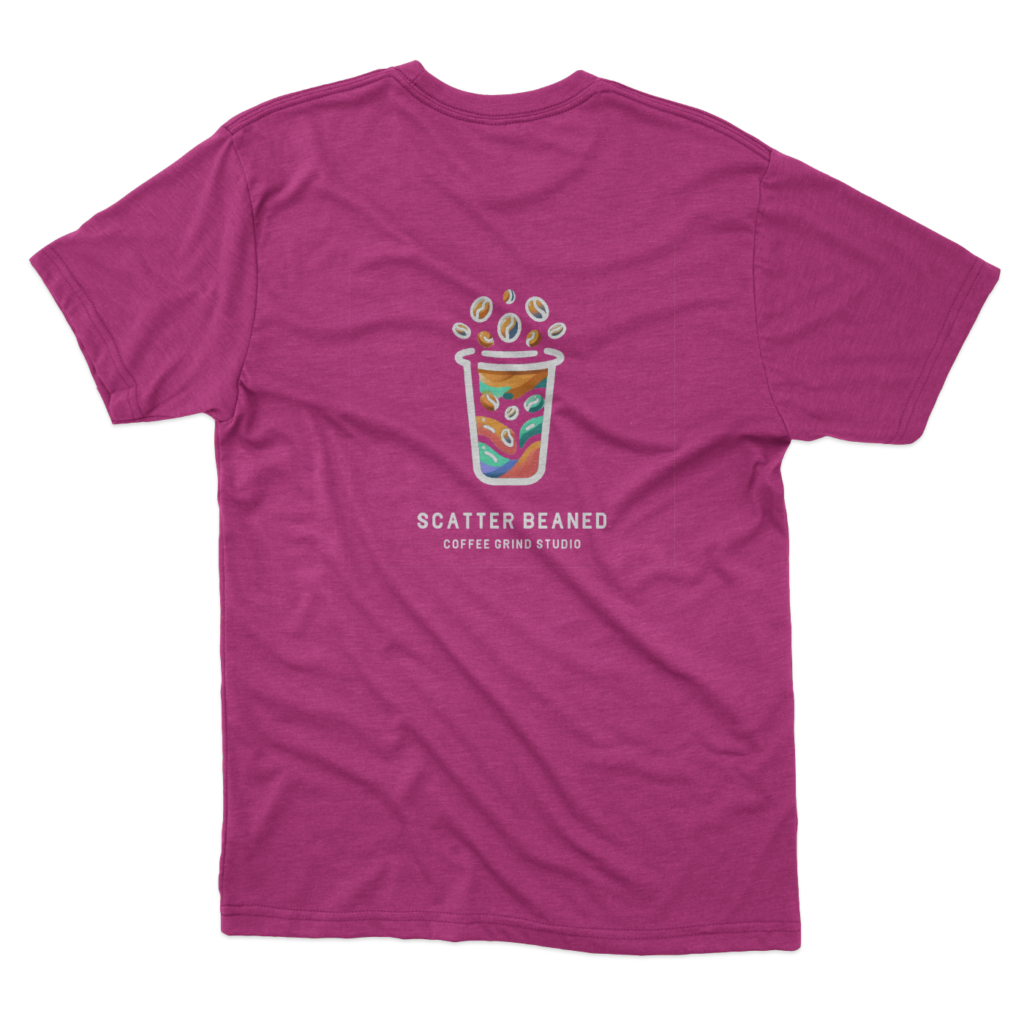
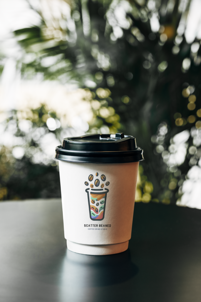
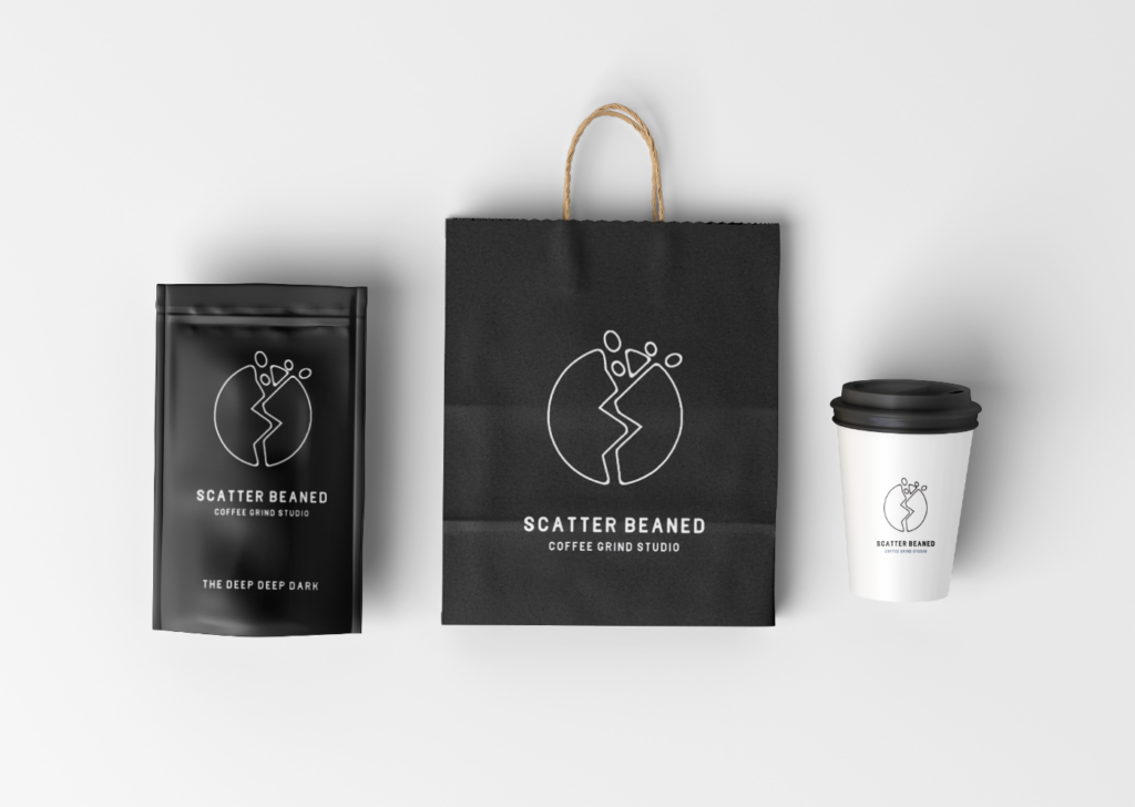
The brand’s look will adapt to each city, yet Scatter Beaned’s core attributes will remain consistent. I’ll capture the coffee house’s lively and modern spirit. The logos will showcase a stylized scatter of beans with playful elements. Scatter Beaned’s tone, light-hearted and friendly, fosters camaraderie in the coffee experience.
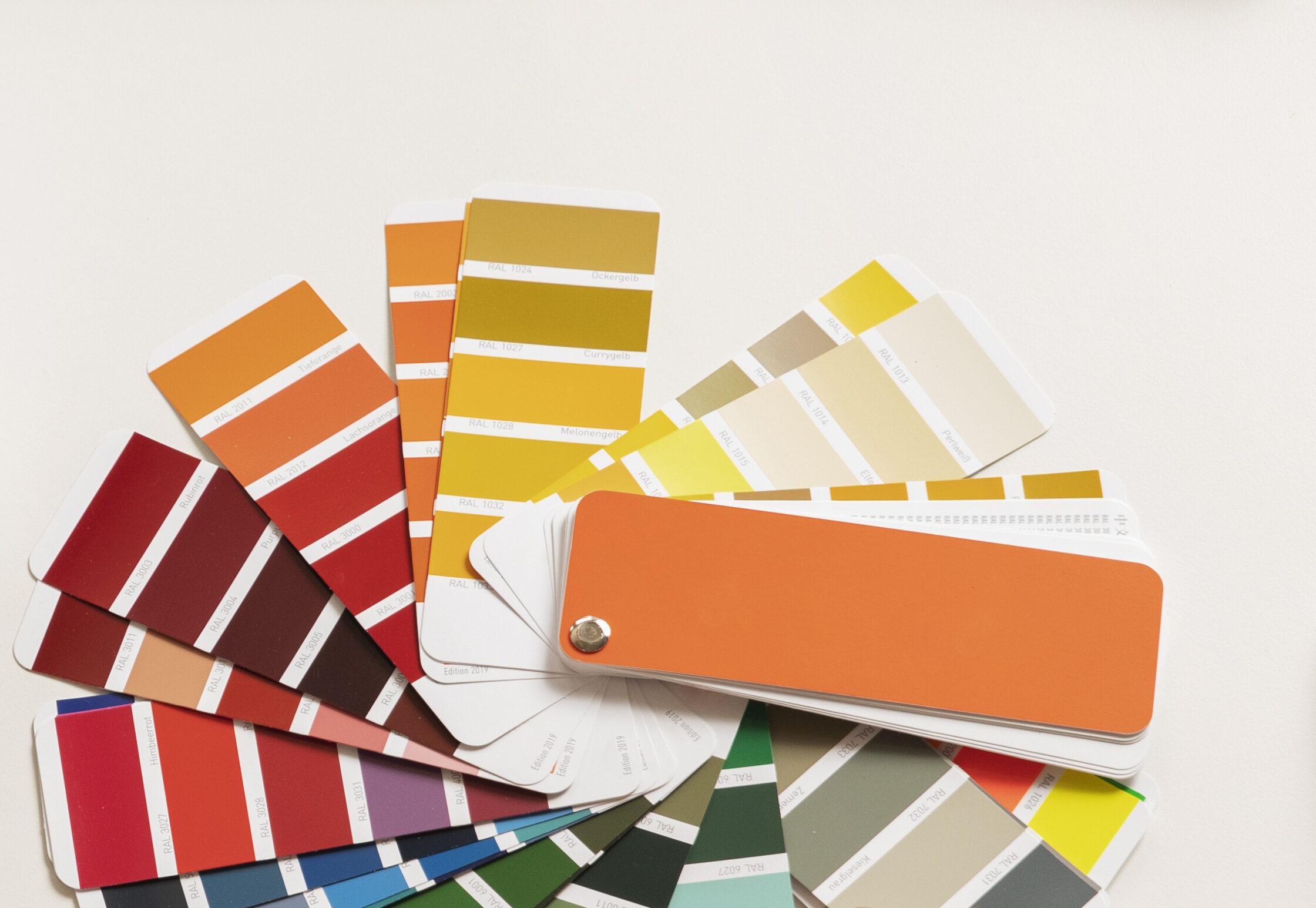
I use the company’s brand profile to set clear boundaries. These boundaries often enhance design results by offering direction and focus, preventing creative overwhelm.
Font Selection
Selecting Delio as the font meets these guidelines really well. Its rounded edges add playfulness, making it approachable. Yet, its tall, robust structure exudes authority and reliability, balancing friendliness with respect. Delio sends an inviting yet authoritative message. It will serve as a great foundation for all following logos. Now, I’ll shift my focus to designing complementary artwork.

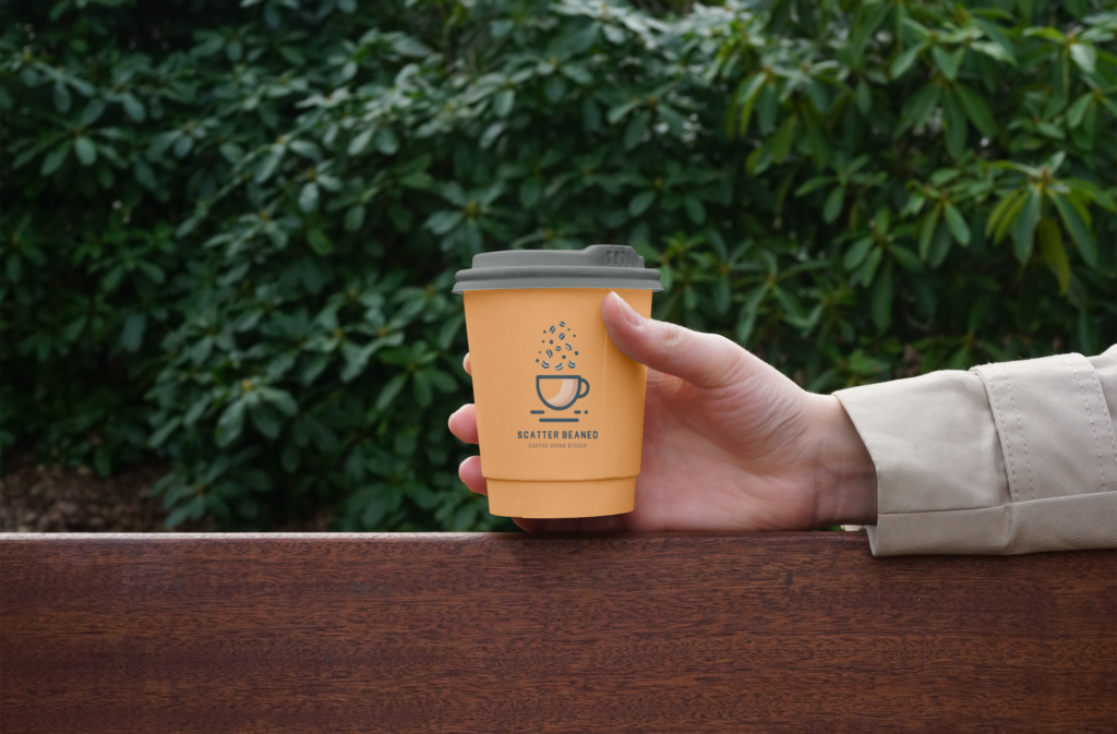
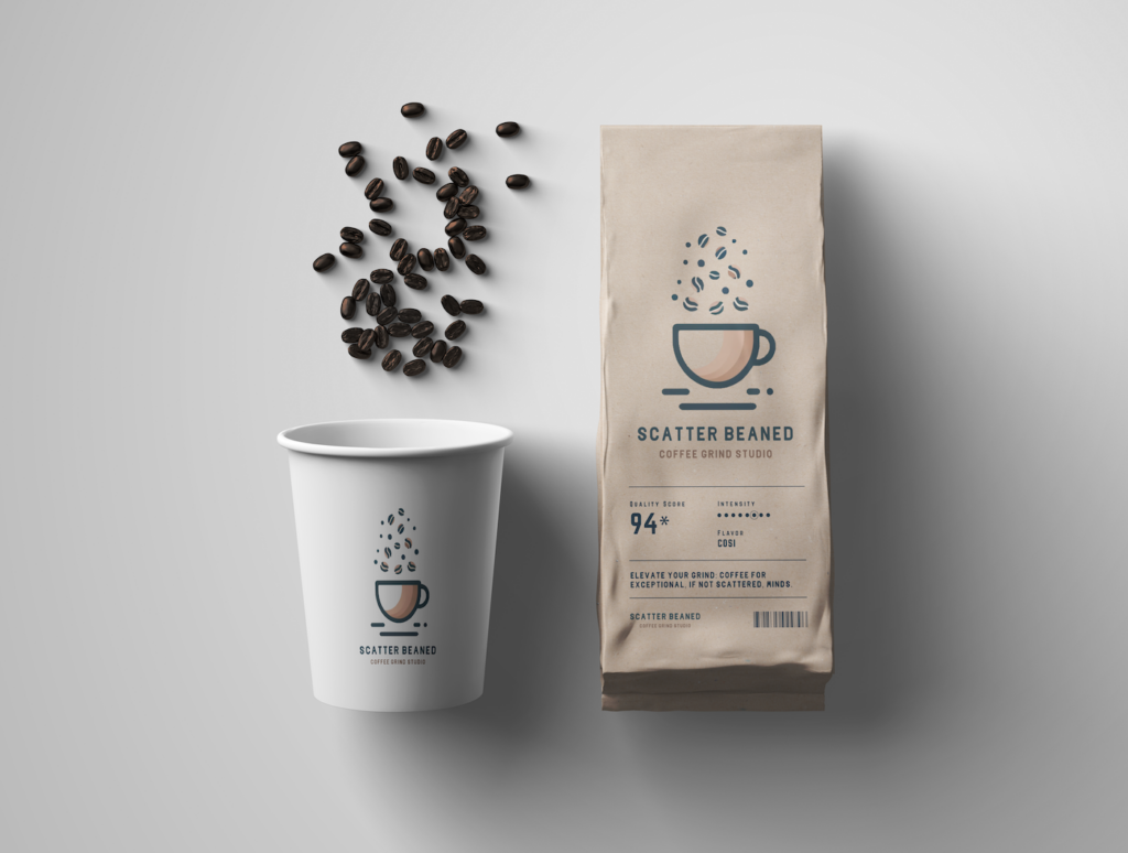
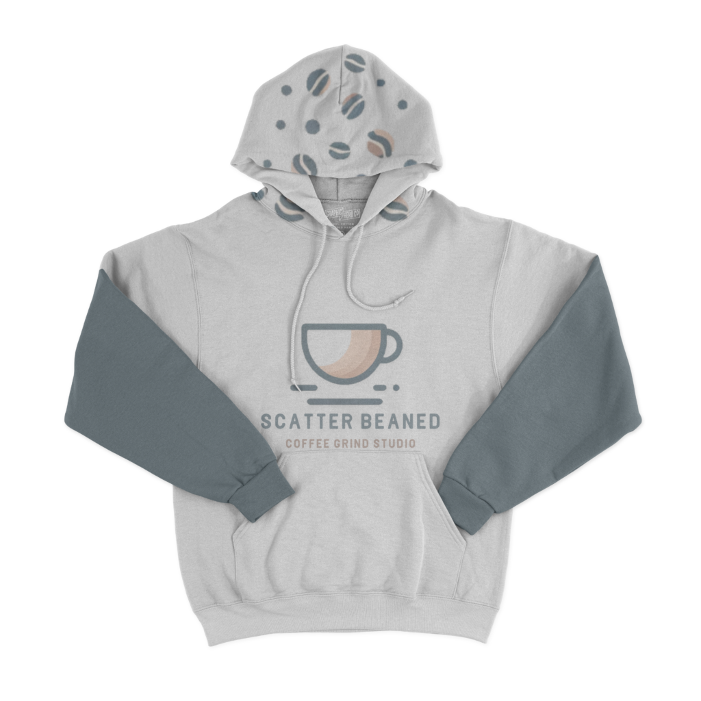
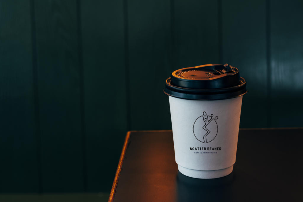
Raleigh, NC
I’ll draw inspiration from Raleigh’s unique blend of nature and urban vibes here. This logo version will embrace organic lines and a humble palette of greens and earth tones, as a nod to the “City of Oaks.” My goal is to capture the mix of city and nature, creating a serene haven for coffee lovers who value tranquility and a connection to the outdoors.
This logo’s simplicity is perfect for web and print, especially after knocking a few beans off the top, yet it retains a playful charm that stands out on merchandise. By incorporating a hint of a face with a neutral expression, the cup is positioned to play on the “Scatter Beaned” name, inspired by “Scatter Brained.” Marking this location as a place where customers can gather their thoughts over a cup of coffee.
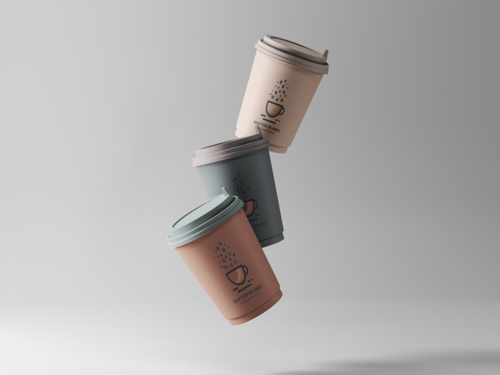
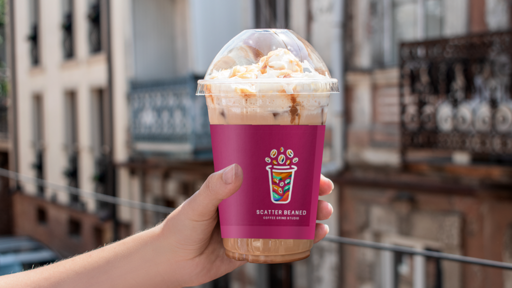
Miami, FL
Getting it right for a coffee shop in Florida offers another set of challenges. First of all, forget the usual visions of steamy cups and everything warmth. I’ll envision the coffee house as “chill” instead using colors and tones to match. Second, the color palette the brand is competing against for attention is the sun. The designs must stand out in the glaring light, echoing the vibrancy of Miami’s streets and beaches.
I’ll use an unusual color scheme of turquoise and pink to fill the space with life. Adding randomness and asymmetry, I aim to create a dynamic backdrop that with plenty of space for color to occur. I’ll keep the scattered beans but replace the cozy cup with an iced version, perfect for the setting.
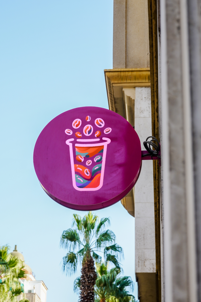
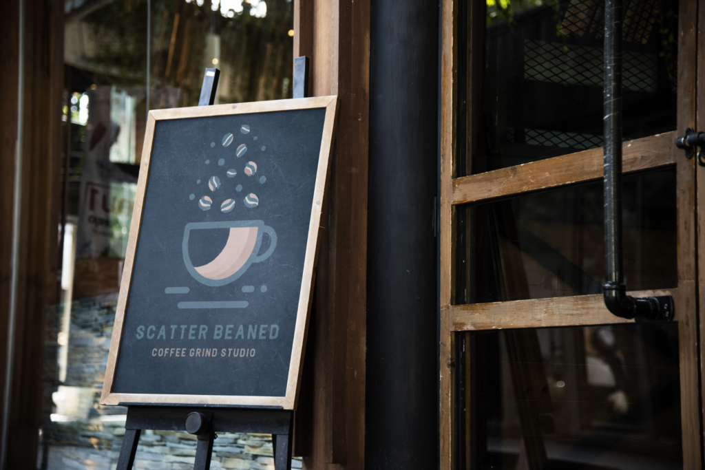
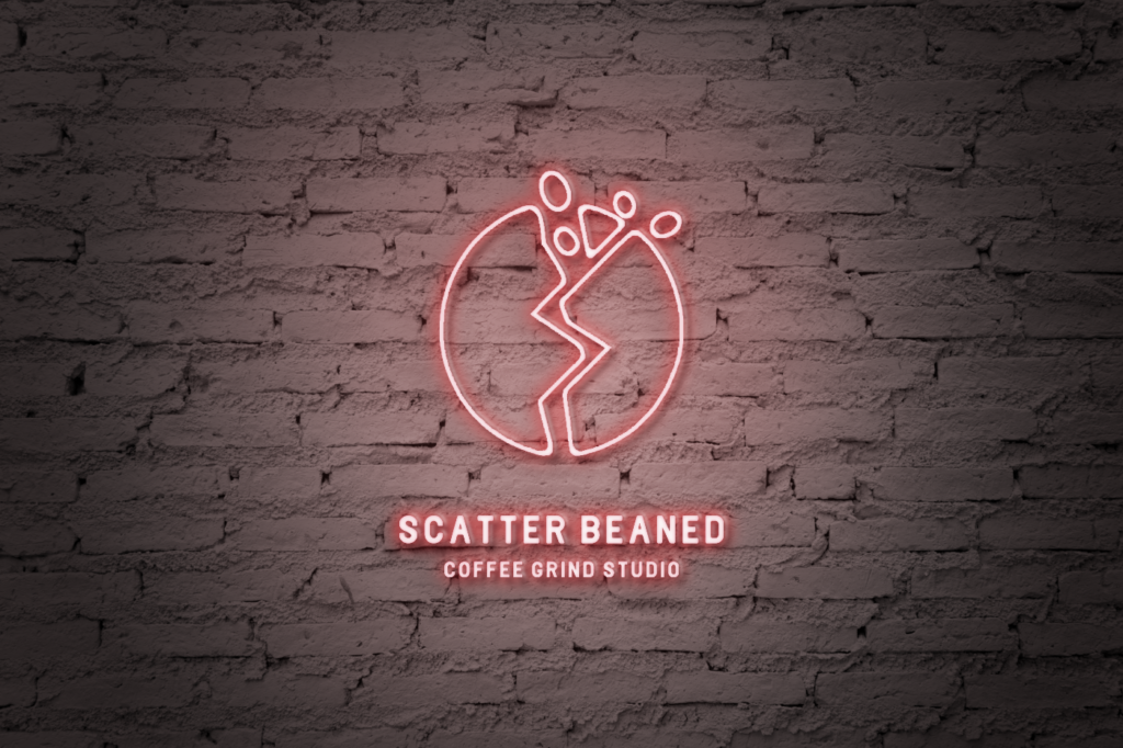
New York, NY
In this setting, it’s neon light that confronts you with its glow. To harmonize with the vibrant scene, I’m simplifying the color palette to one subdued shade, while still keeping things playful. This strategy nods towards minimalism, aiming for a subtle yet captivating presence where typically, more is more. The one-color logo blends in with various images, ensuring it enhances rather than dominates. Yet, when necessary, it boldly stands out against other vivid displays.
For this walkthrough and every project, it’s important to recognize that every element is a strategic move to tell a distinctive story. These decisions are more than just about looking good; they showcase what the brand is all about and how it fits in with the community. Branding is so much more than just making things look nice. It’s about crafting experiences that truly click with people and their surroundings.
GET IN TOUCH